TWF Bot
Staff member
- Joined
- Nov 29, 2020
- Messages
- 3,057
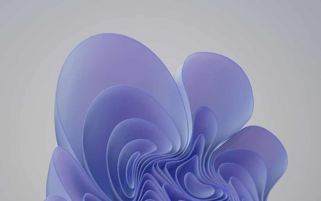
The PANTONE Color of the Year for 2022 has been announced: PANTONE 17–3938 Very Peri. The color — a dynamic periwinkle blue hue with a violet-red undertone — will now start appearing in Windows 11, Teams, Microsoft Edge, PowerPoint and more, the Microsoft Design team said on Thursday. "Color is a part of every design decision we make here at Microsoft, and we wanted to incorporate this new color into our designs in a way that could inspire people to feel more empowered and creative in their daily endeavors," the team said in a blog post. "Periwinkle blues are special in that they encompass the trusted and dependable qualities of the blues, yet their purple cast makes them feel more playful and joyous. This simultaneous message of credibility and excitement sets an ideal tone for creative collaboration and personal expression, which are needed more than ever at work." [caption id="attachment_176672" align="aligncenter" width="1024"]
 New Windows wallpaper featuring PANTONE Very Peri color[/caption] Head over to the blog post for details on what went into the creation of the new color and how the Microsoft Design team is rethinking digital experiences for Windows, Microsoft 365 and more. Get Windows wallpaper in Pantone Color of the Year 2022 - Microsoft Store.
Continue reading...

Continue reading...